The previous post focused the extent to which Turkey’s revised GDP data changed the recent history of economic growth in Turkey. A particularly striking fact of the new series is how much higher the growth rate in GDP in Turkey has been ever since the global financial crisis in 2008/2009. Of interest is then also how this changes Turkey’s economic performance in a comparative sense internationally, both in terms of economic growth as well as key economic indicators.
In this blog post, I take as the basis of economic performance the change in real GDP per capita obtained from the most recent October 2016 World Economic Outlook (WEO) from the IMF. For most of it I will show how this measure of economic growth – in two periods of six-year-averages for 2004-2009 and 2010-2015 respectively – correlates with a selected number of key economic indicators, most of which are included in the WEO database, and how much of Turkey’s (and other countries’) growth can be explained by a relatively simple regression model including a number of indicators of interest.
These indicators are: the natural logarithm of the average GDP per capita during the preceding six-year period, the natural logarithm of the average of population size during the preceding six-year period, the average growth rate in GDP per capita during the preceding six-year period, the current account balance as a % of GDP, the CPI inflation rate, the investment rate as a % of GDP, government debt as a % of GDP, and the unemployment rate. In addition, I also draw on the World Development Indicators database from the World Bank for labor force participation rate, domestic credit to the private sector as a % of GDP, the age-dependency ratio, the urbanization rate, and from the IMF’s Balance of Payments database I also add the net international investment position (NIIP) as a % of GDP. For the investment rate, private credit, urbanization, and the NIIP-to-GDP measures, I also include a change variable with each measured as the change between the average during one six-year period and the corresponding average of the preceding six-year period. The IMF WEO indicators are quite standard and hopefully require little introduction. Most of added variables from the WDI are a bit Turkey-specific as they will show Turkey’s comparatively low labor force participation rate, the rapid growth of private credit in the economy, and the change in urbanization serving as a proxy for factor that could drive some of the large construction investments apparent in the new revised GDP series for Turkey.
The bivariate relationships between real GDP per capita growth and these indicators are plotted below for all so-called “emerging markets,” defined here as Argentina, Brazil, China, Colombia, Czech Republic, Hungary, Indonesia, Israel, Korea, Malaysia, Mexico, Peru, Romania, Russia, Saudi Arabia, South Africa, Thailand, and Turkey. (The use of a sample of emerging markets is both for relevance and exposition purposes.) For Turkey, data using the old versions of its national accounts series are in dark red, with the new version in red. I also plot a regression line for this selected sample, which is highlighted in blue whenever the regression coefficient is statistically significant at 5%.
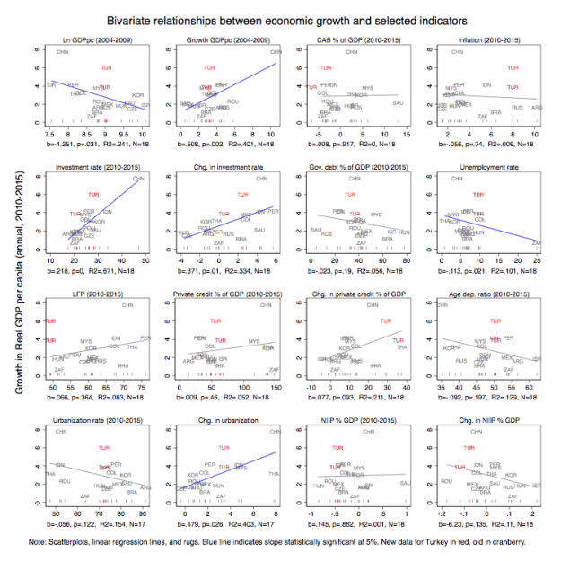
(A more high-resolution version of this graph is available here.)
First, what should be rather striking about these graphs is not just the absolute change in the average growth rate for Turkey following the new revision (around 2 percentage points increase in average annual growth in GDP per capita) but also how it’s catapulted Turkish economic performance to near-China growth rates. Second, as indicated in the previous post, the main change in the new Turkey GDP series is the increased prominence of investment in driving growth. Whereas before the revision Turkey had the fourth lowest investment rate, after the revision it has jumped ten ranks to have the fifth highest investment rate in the sample. If the Turkish economy was a cultural pet meme, it would imply a transformation from “Tombili” to “Asian Tiger.” As a consequence then, in terms of real GDP per capita growth, the new series implies leapfrogging Indonesia and Peru to move from fourth to second place behind China.
Third, even with the new revised data and the accompanying higher investment rate, Turkey’s economic growth still looks much higher than what is predicted by the regression line. Turkey’s regression residual, the difference between the observed value of Turkey in the above graphs and what the regression line predicts, looks unusually large. Even in terms of the investment rate, where the revision meant Turkey now has a much higher rate, the residual is still large. This contrasts with China, for example, which has a much higher growth rate as well as a correspondingly much higher investment rate (and similarly with past growth), which thus makes it look less puzzling.
Looking through the other graphs, it is clear that none of the other indicators can really explain why Turkey’s growth has been so high during the post-crisis period. In fact, if one focuses on the horizontal values of the graphs, it’s not really that clear why Turkey would have such a high investment or economic growth in the first place. It’s had among the largest negative current account balances in the sample, the third-highest inflation rate, the fourth-highest unemployment rate, the lowest labor force participation rate and a large, sliding, negative international investment position. This further distinguishes Turkey from other high-investment rate countries such as a Korea and Indonesia, who tend to exhibit the opposite traits in many of these dimensions. In other words, more chubby house cat than roaring tiger.
So then, how much of an outlier is Turkey overall, and was it always such an outlier?
In order to investigate this, I will add back the other countries from the WEO dataset, albeit purging from the data set 1) countries in the lowest 25th percentile in terms of GDP per capita or 2) population size, 3) countries with smaller land areas than 10,000 square kilometers, and 4) countries with oil and gas exports as a share of GDP in the upper 90th percentile. This removes most of Sub-Saharan Africa, tiny island states, and countries overwhelmingly dependent on oil and gas (in other words, countries more likely to have very volatile growth rates that might be structurally hard to predict).
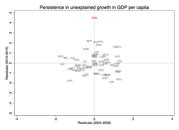
I then combine the previous predictors of the six-year average annual growth in GDP per capita in a multivariate (cross-country) regression and extract the estimated residuals. I do this for two regressions: one regresses the 2010-2015 average annual growth rate in GDP per capita on the 2010-2015 averages of the predictor levels or changes (between the 2010-2015 average and the 2004-2009 average); the second does the corresponding regression for 2004-2009 growth on 2004-2009 predictor levels and changes (between the 2004-2009 average and the 1998-2003 averages). (Note that I am currently not interested in establishing a causal relationship, this is merely about what predicts the outcome variable). The absolute values of the residuals are plotted below, with positive residuals as circles, negative ones as triangles. The solid (hollow) red circle/triangle denotes the residuals for Turkey, the blue ones are for other emerging market countries, and gray represent other countries in the sample.

(A more high-resolution version of this graph is available here.)
Here, the degree to which Turkey is an outlier is even more obvious. Not only is Turkey’s residual the largest in absolute terms, but it’s also more than twice the magnitude of the 95th percentile (i.e. it’s a clear outlier compared to the rest of the distribution). The reason why Ireland has the second-highest residual of Ireland has a pretty good explanation: GDP growth in 2015 was three times the previous estimate “after overseas companies were included in value of corporate sector”. The rest of the residuals are not abnormal in any statistical sense (for example, if one plots studentized residuals instead, if Turkey and Ireland are dropped, there are no observations with residuals larger than conventional thresholds).
Moreover, the average annual growth in real GDP per capita was 6%, whereas the estimated residuals from the above regression is 4.63%. This in turn means predicted growth based on fundamentals (or rather, the included predictors) was a much more modest 1.6%. In contrast, China’s comparatively small residual means its even higher observed growth rate is almost identical to what the model predicts. Also, even with Turkey’s old GDP data, the residual is still the largest. (The corresponding predicted growth for Turkey’s old national series is even lower at 0.3%). The new GDP series has certainly added to the magnitude but it hasn’t really changed the underlying issue. If Turkey’s growth model before the revision was from Mars, it is now from Mercury. (Somewhat poetically, and to further relate this to the title of the post, the relative increase in Turkey’s residual moving from the old to new national accounts series is roughly the same as the relative increase comparing Mars and Mercury’s distances to Earth).
Now move to the above right-hand graph, which plots the same kind of residuals but for a regression estimated on the preceding six-year period 2004-2009 leading up to and including the financial crisis. The same kind of model that before failed to predict Turkey’s economic performance now predicts it the most accurately among all the countries in the sample. And, opposite to the 2010-2015 period, Turkey’s revised GDP series makes the model more (not less) accurate in predicting Turkey’s growth.
The degree to which Turkey is an outlier in the model is noteworthy. The model itself not only predicts most other countries quite well (the adjusted R-squared of the 2010-2015 and 2004-2009 models are 0.58 and 0.76 respectively – i.e. not too shabby for a growth regression without any geographic fixed effects), but also used to be able to predict Turkey’s economic performance very precisely.
One interpretation is that the higher-than-predicted growth rate is evidence of an unusual period of exceptional economic performance, requiring explanatory factors beyond the standard economic indicators used by the IMF (and to some extent also the World Bank). Thus, in the middle of a neighbor’s brutal civil war, an unprecedented political civil war within its own borders, and with analysts lamenting the deterioration in economic institutions in the country, Turkey somehow managed to achieve economic growth rivaling that of China, even as the fundamentals that so well predicted growth in the past would have indicated barely a quarter of the observed growth. Another interpretation is that Turkey’s national accounts series, new and old, suffer from some kind of measurement errors resulting in the reported economic growth being this high. At this time, I do not know which it is.
Regardless what the underlying reason is, it’s hard to see this kind of extreme above-fundamentals performance to be sustainable in the longer run. Not only is the failure to predict growth to such an extent unusual for the model used, but there is also no systematic evidence of persistence as can be seen in the graph below: the residuals from the model in the 2004-2009 period does not predict the residuals from the 2010-2015 model, and so even if a country did experience above-fundamentals growth in one period, this doesn’t mean it will do so going forward. This raises the question of when an adjustment back to fundamentals will take place and how.
Turkey’s economy is already under severe strain, with a sliding currency, contracting GDP in the last recorded quarter, rising unemployment; all on top of an unprecedented domestic purge, the Syrian civil war, and the conflict between the Turkish state and the PKK. This post suggests there may be an additional fundamental reason to expect lower growth in Turkey going forward, namely that, at some point, Turkey’s economy is expected to return to Planet Earth and its accompanying economic fundamentals. So far, how it ever left remains a bit of a mystery.
Hat tips: to Citibank economists Ilker Domac and Gultekin Isiklar for noting that Turkey’s new national accounts implied a disconnect between economic performance and some of the structural factors included above and to Murat Üçer, both for letting me know about the former as well as the cats meme comparisons. Any errors and mistakes are mine alone.
